Monday, 28 March 2011

V escapes

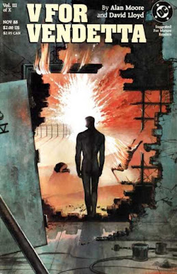
Cover to V For Vendetta issue 1


Art by David Lloyd, V For Vendetta #3. Cover dated November 1988

And so we have the first cover, and the first of what I suspect will be a number of images from Alan Moore and David Lloyd's V For Vendetta.  It's a beautiful cover, the glow of the explosion hiding the profile of V's face purposefully. While that fits with the story, it also pushes the reader to the idea that V's character is explosive and battle hardened. The burning man to the right and nearer the explosion than V flails helplessly, and is studiously ignored by our hero, whom Lloyd has posed in an art deco Superman manner, reminiscent of the Fleisher animated series.

The foregrounding work by the leaning iron bar in the bottom left of the cover is impeccable; it floats above the scene itself and makes you want to reach out and move it. Like the Doom Patrol panel from last week, this is another image that can easily have existed in real life, and while it draws from art deco stylings there's also a sense of the atrocities of World War II. V's shadow pulls us into the picture, and although we cannot see where he is looking, we are aware that he is confidently striding into a wasteland in a direction straight towards chaos; this is the first instance yet of a character moving, unhurriedly and purposefully, towards an explosion.
Sunday, 27 March 2011

Sunday links

Here's a few links to catch if you've missed them being broadcast elsewhere:

Eddie Campbell is interviewed at the Hooded Utilitarian

Jim Shooter has a blog

FPI review Dylan Horrock's masterpiece Hicksville

Steve Finch creates covers for comic books as if they were 1960's paperbacks

Pat Mills is interviewed at FPI here and here

Saturday, 26 March 2011

What's it all about?

 Hi. I didn't really imagine when I started posting explosions that the world would suddenly follow suit and bombs would start falling, but then again, I'm left scratching my head trying to imagine a time when bombs haven't been falling. So what's it all about?

I had intended to launch a blog which covered my thoughts on pop culture, taking in anything from my thoughts on music through comics to film.  But the more I tried, the more I couldn't see how I wouldn't end up replicating something already out there. And I had become very taken with blogs such as Four Color Process and thought I'd try something in a similar vein.  Seeing as I'd registered this domain name and made a stab at something already, I decided I should keep it as a going concern, and so my mind turned to explosions.

Friday, 25 March 2011

Jump!


Art by Frank Quitely, New X-Men #115. August 2001

Quitely and a couple of parachuting X-Men. I wanted to round out the week with a fairly contemporary image, something which spoke of colour to contrast the black and white of Eastman's Turtles.  I really should have credited colorist Hi Fi Design, because a lot of what makes this image work is due to the colour.  Which is to take nothing away from Quitely's composition, with the James Bond styling of Cyclops just right of the epicentre, pulling our eye to the glare on his, well I think we'll call that his backside. Quitely has Cyclop's feet at different angles, yet maintains the image in the reader's mind that Cyclops is a character that is all about control; he's a character who knows which way his feet are pointing. And Quitely has managed to pack all four elemental forces in here: the wind implied by the parachute which holds Cyclops in the air forcefully against the blast; fire raging from the explosion itself; rock enclosing the course of the river; and that waterfall. What a brave line Quitely uses to separate fire and water, it's a very thick line which implies either a sheer drop or a viewer blinded by an explosion.

Thursday, 24 March 2011

City at War


Art by Kevin Eastman

Teenage Mutant Ninja Turtles volume 1 #50. August 1992

Following on from Gibbons is a two page scene from Kevin Eastman and the other major comic book sensation of the 1980's, Teenage Mutant Ninja Turtles. To my mind this is the least accomplished image I have so far used. The buildings, while accurately rendered, lack character, and the explosive force feels lacking around the doorway, with not enough debris blasted outwards.  The store sign hangs too lumpen in the air and the blasts from the top windows seem too stylised, too glossily blasting up rather than outwards. And yet... there's the way Eastman has used tonality to inform the white heat of the explosion, the way the door hangs in the air, taking the brunt of the force and blunting its anger through the heaviness Eastman's lines have leant it. And the dissolve to blackness on the second page of the spread, truncating the image and propelling us forwards into the story.  I like this scene, and I think most of the flaws are probably in my eye; I can't help but feel the perspective is a little forced and we're looking at an unflattering angle. 

Wednesday, 23 March 2011

Just a Dream


Art by Dave Gibbons, Watchmen #7. March 1987

From the wide screen to the narrow dream sequence panel.  Gibbons image manages to conjure the surreality demanded of the script through the lack of grounding; the explosion hangs in the air having burst in from some distant vanishing point. It's a very lucid scene, defined by the white starkness of the background creating silhouetted skeletons and the juxtaposition of the loving embrace composed of long-dead bodies. And the narrowness of the image adds to idea that it's a half glimpsed nightmare. 

Tuesday, 22 March 2011

The Train is Bang on Time


Art by Eddie Campbell, The Black Diamond Detective Agency. May 2007

Eddie Campbell's train wreck from The Black Detective Agency. It's a stunning piece of art, and while the similarities with the Ditko panel presented last week are clear, Campbell himself has stated his inspiration was something else; a Comics Journal back cover which re-coloured a Wally Wood panel. The rendering of the locomotive engine in the foreground is astonishing, and the energy is brilliantly focused. It's a tour de force from a modern master of the form, and a very rare two page spread from Campbell to boot.

Monday, 21 March 2011

The Doom Patrol Die?

Panel from Doom Patrol issue 121 in which the Doom Patrol are at the time killed in an explosion


Art by Bruno Premiani, Doom Patrol volume 1 #121. October 1968

After the illusory death of Calvin, we move to the temporary death of the Doom Patrol. This is to date the most realistic scene depicted, it is a scene that could easily have existed in real life and the setting used by Premiani evokes a war comic.  It is also the first image I've used which gives voice to the explosion, the onomatopoeic KAWHOOOOOOOM to my ear missing a B. This panel must have been shocking at the time of publication, given our expectations that good guys survive, and Premiani's art carries the force of that impact in its brightly coloured, debris-full explosion.

Sunday, 20 March 2011

Calvin's Head Explodes


A panel from Calvin and Hobbes by Bill Watterson, in colour


Art by Bill Watterson, Calvin and Hobbes. July 7, 1991

From Dan Dare to where?  Well, after Hampson's realism we turn to Bill Watterson'sCalvin and Hobbes.  The cartoon line is ably demonstrated here and the scene bursts with the energy and fun Watterson's talent was able to call upon. The image is a link to all that have gone before, capturing the chaos of Kirby, the similar "in thrall to the explosion" of Ditko, the actuality of the meaning that Shuster conveyed, and the endless directionality and perspective of Hampson.  And yet here, Watterson has used all those ideas in the service of a gag. It's a beautiful actualisation, Calvin's feet and hands show the surprise we imagine him to feel without any sense of sorrow.  Through his line we know Watterson is kidding; that Calvin will return safe and sound in the next comic strip panel. It's art at its most temporary and its most vital.

Friday, 18 March 2011

The spaceship explodes


Art by Frank Hampson, assisted by Don Harley, Eagle volume 6 #21. 27 May, 1955

I knew I wanted a British image fairly early. And I knew it had to be something by Hampson from Dan Dare. Dare's place in the British cultural landscape has slipped a long way in recent years, alongside other similar icons such as Action Man and Blue Peter, but in the strip's heyday of the 1950's and 1960's Hampson and Dare were influential in the development of the British landscape, both culturally and literally.

Hampson's art here is probably a little rigid, there's a slight lack of movement in the scene, and the energy is hampered somewhat by the colouring and the stars detailed in the background. On the plus side of the ledger we are treated to Hampson's iron grip on draughtsmanship and perspective. He captures the total directionality of space with thrusts from the blast in every direction and smaller spaceships adding grounding to contrast with the silver cigar fired at the reader. The caption placements are impeccable too, one over the art and one under. A solidly constructed image working hard to draw the reader into the story.

Wednesday, 16 March 2011

Doctor Octopus is born


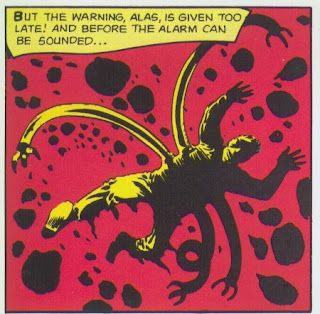
Doctor Octopus with explosion in background, art by Steve Ditko


Art by Steve Ditko, Amazing Spider-Man Issue #3. Cover dated July 1963

From Kirby to Ditko, looking for something from Doctor Strange but eventually alighting on this scarlet bathed Spider-Man panel that features the birth of Doctor Octopus.  It's such a simple image so beautifully constucted.  Ditko has placed us in the heart of the explosion, the viewer also pushed back by the explosion, the redness searing our sight past anything but rubble and Otto Octavius, chaotically falling. But while the man Octavius is fully in thrall to the force of the explosion, note how the robot arms are not. Instead they are in control of themselves, in their element within this destructive force.

Tuesday, 15 March 2011

Toxl the World Killer

a panel depicting a planet exploding


Art by Jack Kirby, Weird Mystery Tales Issue #2. Cover dated September – October 1972

It's an early Kirby DC piece, but late in Kirby's overall career. And the page bursts with the energy presented. Again I'm thinking cinema, but this time I can't help but wonder what sort of debt Kirby is owed by the modern blockbuster; the cross pollination between the two mediums is perhaps worthy of greater study than I can afford here. The story from which Kirby's piece comes is minor in the totality of his career, but the amount of detail packed into the detailing of a planet's demise is immense. Kirby pulls no punches producing a sumptuous image of chaotic destruction. You can't help but wonder what visions he could so eloquently have expressed utilising today's colouring techniques. Truly a master.

Monday, 14 March 2011

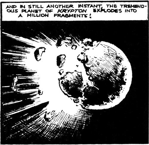
Krypton Explodes

Krypton Explodes

Art by Joe Shuster, Superman Daily Strip. January 26, 1939


Shuster's first representation of Krypton exploding; it's arguably the most important explosion in American comics history. It's also a beautiful image, Shuster's line capturing something of the brittleness a planet must necessarily have, even if we refuse to see it. I can see in the image an influence of cinema, not just science-fiction film serials, but the way an image would be paused over in, say, a Harold Lloyd feature, before or after a caption was seen. There's a brittle stillness to the image, which enables it to capture the sombre moment, not least through the use of blackness in the surrounding space. I can't help but be reminded of this explosion.